Indian craft for contemporary culture
CLIENT \ Counterfeit by Manai
SERVICES \ Visual identity, launch content, art direction
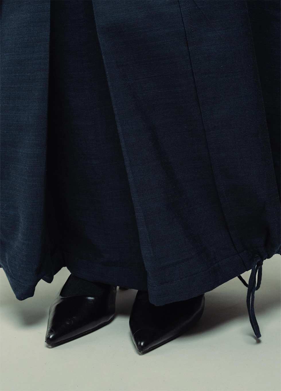
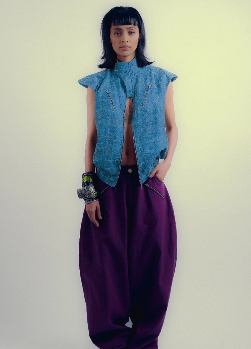
Counterfeit by MANAI reimagines Indian textile craft for everyday creative life. We built a complete visual language that connects traditional techniques with street-led, global aesthetics.
The Audience
Positioned at the intersection of Indian craft and contemporary subculture, the brand targets culture-driven consumers aged 20–60. The goal was clarity - a space where craft could meet commerce without losing intimacy.
The Impact
Counterfeit’s visual system bridged craft and contemporary culture through design, not nostalgia.
The launch reached 33K organic views, 5.5K unique accounts, and 1.6K interactions in the first month, proving that Indian textiles could move with streetwear’s rhythm.
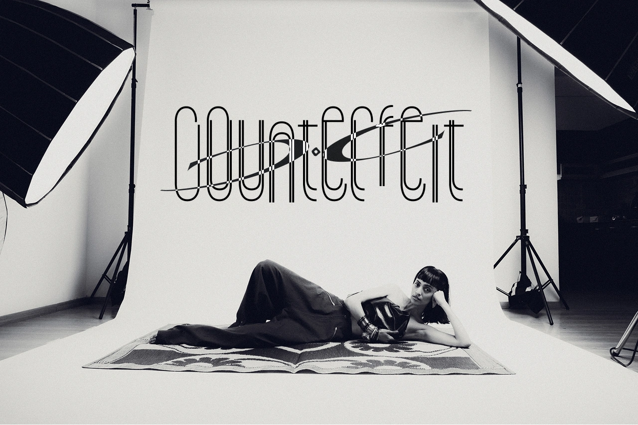
The identity drew from bandhani dots and safety pins, symbols of repetition, rebellion, and repair.It established a design world that was graphic yet handcrafted, a balance between textile logic and subcultural energy.
The logo is designed to be used flexibly. It can be tesselated with multiple different possibilities, repeated in different scales, or blended onto images. This usage of the logo speaks to the brand’s edgy, non-conformist ethos.


Brand collaterals featuring the logomark and illustrations capturing the young, edgy and dynamic spirit of the brand.
.webp)
The website uses a muted grey backdrop with subtle gradients to draw full focus to the clothes, creating a clean and intentional visual hierarchy. Smooth transitions and quiet navigation ensure the product, not the interface, carries the story. The result is a refined digital experience that elevates the brand’s edge without distracting from the work.


The shoot’s creative direction was built around a retro-inspired yellow-blue tint, using nostalgic framing and warm tones to visually echo Counterfeit’s core philosophy — subverting the familiar.


For the launch content , we broke away from standard teaser formats by using Ritika Jathar’s illustrations, animated by Aashna Pednekar, layered with references from Edward Scissorhands and Loewe’s logo trend.
The cinematic, pop-aware approach resonated with a film-loving, internet-native crowd, generating over 10K views across platforms in the first week alone